Creating an exciting video with perfect editing and an attractive title is not enough to get the number of clicks that you aim for, on your YouTube channel. As a beginner, getting an adequate number of views is not as easy as it seems on professional YouTube channels. Even with informative and fun video content, beginners tend to suffer from the click-through rate. With high competition on social media, watchers won’t click on your video if you cannot attract them at first sight. And here comes the importance of YouTube thumbnails.
YouTube provides some time stamps of the video from which you can choose your thumbnail but that is not enough for the viewers to click on your video. Let’s learn the important features of a YouTube thumbnail and how to create them.
Size
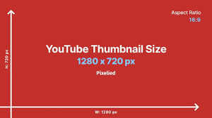
The ideal size of a YouTube thumbnail is 1280 pixels X 720 pixels with an aspect ratio of 16:9 and 640 pixels in width. The minimum size of the image should be 2 MB so that the image won’t lose its quality when watched on a larger device.

Image
Make sure to use one or more relevant images that show the video’s contents. For example, if the video is about a makeup review, then use the product’s image in the thumbnail. Or, if it’s a reaction video then add the image of your reacting face and what you are reacting on. Use Blend Photo Editor to get pixel-perfect high-quality cutouts of the images for free.

Font
Once you decide on an appealing title for the video, pick out some of the focus words and put them on your thumbnail. People do not always read the title therefore do not clutter your thumbnail with long sentences, rather wisely use words that somehow sum up the contents of the video. Use contrasting colors than the background to make the words pop and choose a font that can be read easily.

Background
A minimalistic background with a contrasting color scheme can never be a failure to appeal to your viewers. Try to choose a clear and lighter shade that makes the other elements of the thumbnail pop. You can also use an interesting time stamp from the video itself as a background. In that case, use the Rule Of Thirds in photography where you place the focused item on the two intersecting points of the vertical and horizontal lines that divide the image into 9 equal parts. This way you can get adequate space on the other side to put your title.

Tips: Try to do research beforehand on your competitors’ thumbnails on what kind of images, fonts, and styles they are using, and come up with your own unique approach towards your thumbnail that represents your brand.
Experiment with different styles and monitor which one brings you the most view and try to be consistent with the thumbnail so that people can know which one is your video at one glance.
Do not put too many elements on the thumbnail that makes it look cluttered and congested.
Download Blend now and create eye-catching YouTube thumbnails in just minutes with Blend‘s editable free thumbnail template and increase your channel’s subscribers instantly.
