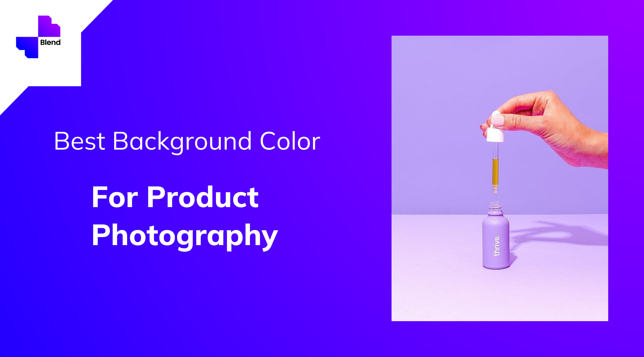
As human beings, we have a type of ability to focus solely on the elements we are most interested in what our eyes are seeing. So, when we click a picture, if we do not focus on all the elements which are needed to enhance the picture, it will ruin it. We do not feel the importance of background in Photographic Composition but the elements in the background can ruin product photography in many ways.

To avoid these kinds of issues, it is important to have in mind what you want to communicate with the photos, what items you want to highlight, what tone should be and how the background affects these aspects.
Having quality and professional product photos makes a big difference in how customers perceive your brand and one factor that is highly important is the colour used in the background.
Why is colour important ?
Well, white colour has always been a safe option to play with. Photos can be a way in which you can tell our brands story related to a particular product. Most of the online shoppers rate product photos as very influential on their online purchase decision. Colour can take an otherwise ordinary product and make it pop off the page.
Not only does colour help display your products more distinctly on the web and in catalogs, it also has a subconscious effect on people’s moods. Using colour strategically, you can evoke the emotions you want your shoppers to feel when interacting with your brand and products.
Colour of your product !
When deciding on your background colour, one of the most important things to consider the color or colours of your product. Some colours play well with others, and some, not so much.
A white background is a ‘safe’ choice but can come with some disadvantages. A light or neutral colour also works great for most products.
“If the product you’re shooting has a lot of warm tones, a cool colour for the background could help the item really stand out.
Using a light background with a dark colour product (or vice versa) would give your image a lot of contrast, which is especially useful when shooting product imagery for a website,” says the design manager of Nations Photo Lab, Niki Maro.

“Alternately; matching a product and background with similar tones would make a much calmer, more nuanced image that could look more sophisticated but have less pop.”
It is true that the white colour is always a safe option to play with, but there are so many colours too and each colour tells us something different each time.
While colour is important, but also the truth is, there is no “best colour.” The colours you choose depend on what you’re trying to convey with your product photos. This requires some strategic planning before your shoot.
Use your brand’s colour
The last thing one would want is to have a handful of quality photos that don’t match with the brand colour theme. One needs to work well with the colour of the brand , to get the most of the product photos .
