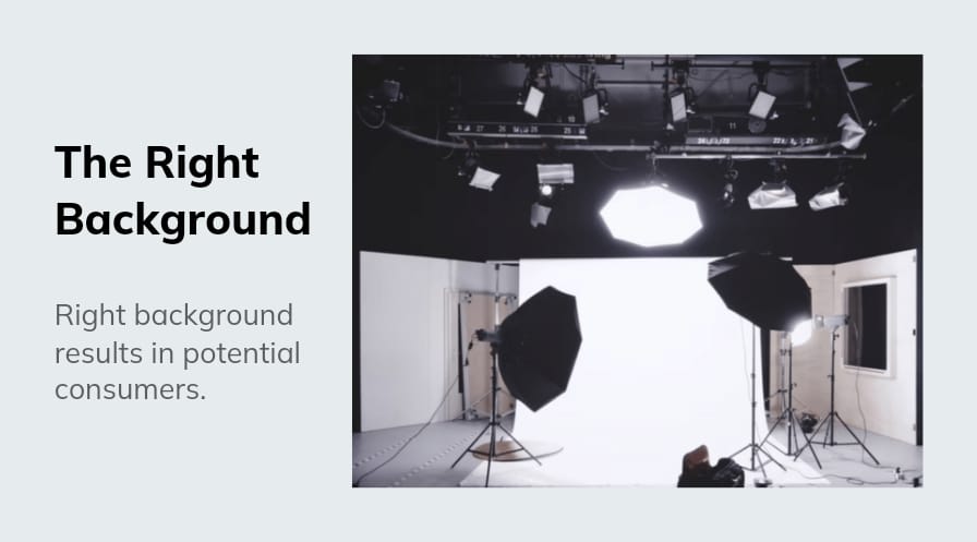
Don’t you feel great when an online order is made on your website or when a customer appreciates you? Of course, you do! Everyone loves getting appreciated for their work, even if it is a small work or a big one. Selling online is a task but making customers shop your products just by showing them online, can be an even big task. One needs to have a good eye and knowledge of product photos and the right background to get potential results.
Various types of merchandise get sold online like apparel, footwear, eyewear, electronics, cosmetics, food, etc and every product requires a different type of presentation. It is not possible to know about each product but a piece of basic knowledge is a must and can be very helpful. Let us try to know a little about how should we use the right background-
Minimal is the key
While selling online, you want only your product to be in focus. For this to happen you need to exclude any kind of distraction that is stealing your product’s focus. For a complicated and heavy product, you can use a simple background, so that the main focus will be on the product’s details and it will give a clear look to the customers. You can choose a background that has a solid color and not many patterns or shades.
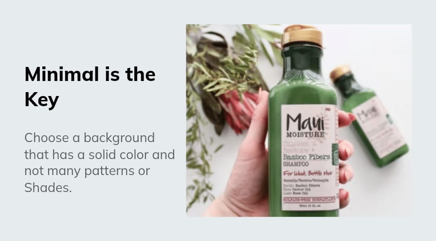
But also keep In mind that a simple background does not give a boring effect to the product otherwise it will not draw attention and customers will not take an interest in purchasing it.
Visual context
A background can be a great way of telling your users about your product. If you are having difficulty in setting a proper solid background, you can try using the background to tell more about what your product is all about. This could set a good mood for the customers to shop.
Try creating a story for your product which can be told to attract the customers which can help them make a purchase. This way customers feel connected and develops an interest in the product.
If not white , then neutral or subtle
It is a known fact that white is a go-to colour for everyone. It helps in giving a picture a more photo-centric visual and is the main reason it is commonly used. Also, using dark colours turns off customers’ mood to buy a product. So, if not white then neutral or subtle colours can be used to grab focus attention.
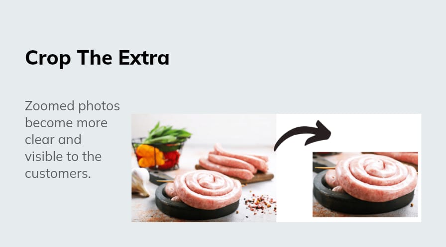
Crop the extra
Sometimes while taking a picture we don’t see the extra space that gets added up but while looking at the image, we notice it. So, it’s better to crop and remove the extra and unwanted space. Doing this will give a zoomed effect to the product and it will become more clear and visible to the customers.
Decide on mood and setting
It is very important to set a proper mood for a customer about what the product is all about as it makes them connect to the product and make a purchase. Whether your product is attached to any emotion like happiness, love, or success, then your product background should be something related to that emotion.
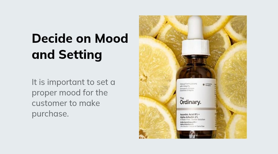
Suppose you sell vintage items but your background is more of a modern type, then it won’t attract the customers as for them it is all about what you try to show them. Adding a modern background to a vintage item will not match whereas a more of a retro-themed background should be should.
Contrasting
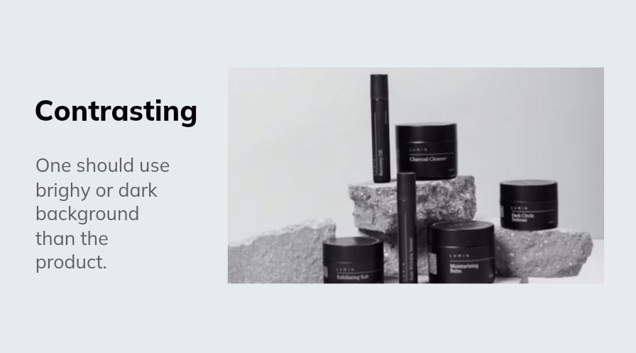
One should use bright or dark background than the product. With careful exposure, we will be able to isolate the product with the addition of proper lighting.
Today everything is going digital, even selling and purchasing, then why not add background!
Digital backgrounds are cost-friendly and easy to create where you can have seamless options to play with. The blend helps you to remove and edit background with just one click.
You need to first remove the existing background which can be easily done using Blend and then add and edit the type of background you want. You can even choose from the 50,000 templates that this app provides.
I hope this article gave you a basic idea about how to choose the right background for your product and how the Blend app can be a very efficient way to complete this task.
